I’ve been researching material options today as well as looking at Thor’s body. I spent a little while also trying a couple of patterns for Loki’s face, so allow me to show you my progress and thinking to date.
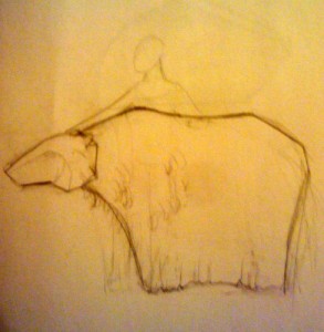 The idea with this one is to create a lightweight rib structure of polyethylene foam and drape it with muslin dyed to match the wood. Over the entire structure, I’d stitch strips of PaperWood, which is a thin veneer backed by paper. I love the way this would look, but suspect that it would be unconscionably loud. The idea with this one is to create a lightweight rib structure of polyethylene foam and drape it with muslin dyed to match the wood. Over the entire structure, I’d stitch strips of PaperWood, which is a thin veneer backed by paper. I love the way this would look, but suspect that it would be unconscionably loud.
Pretty, but probably not actually viable. I’m going to look at cloth to see if there is anything with a wood grain look that might provide a similar look without the sound. |
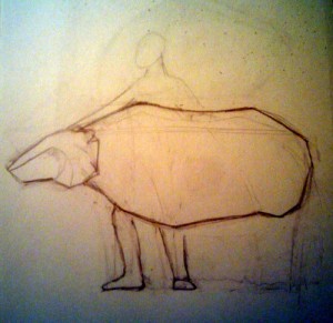 This concept is very similar except that we’re only playing with the body, and not the legs. I’m imaginine this made with very rough felt to look like traditional Norwegian handfelted garments. This concept is very similar except that we’re only playing with the body, and not the legs. I’m imaginine this made with very rough felt to look like traditional Norwegian handfelted garments.
It is similar in concept to what I’ve got in mind for Loki. One reason to create a figure that doesn’t touch the ground is for the practical reason that Loki will be smaller and hence harder to see if he plays the floor. Having no legs gives a lot more flexibility in what the audience will accept as “ground.” Also, it means that the puppeteer won’t have to manage extra limbs. |
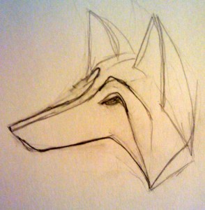 Speaking of Loki. I’ve been playing with his face. Speaking of Loki. I’ve been playing with his face.
The pictures of foxes that I’ve been looking at are all about the ears and the snout. Then they have this fantastic ruff around their heads. It’s also interesting that Loki is not an arctic fox, but a red fox which isn’t native to Norway. It’s more common now, but is crowding out the native. That Loki… such a trouble-maker. You’ll notice that I’m adding eyes now to the concept drawings. When I get to Odin, he’s missing an eye, which means that everyone needs to have eyes to miss. This does make folding the form a little harder, but it should be fun. |
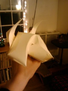 The first attempt snout was too short. Kinda cute, but wrong. The first attempt snout was too short. Kinda cute, but wrong.
I’m also trying to make Loki’s face asymmetrical. As a general rule, people perceive symmetrical faces as more beautiful and virtuous. Since Loki is a mischief maker, I’m twisting his face a little by giving him a broken nose. In truth, I usually make puppet faces asymmetrical because you can get the illusion of a change in facial expression as the light plays over them. But with characters like Loki, I go for really obvious asymmetries. |
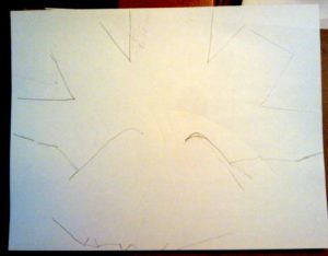 So I made a flat pattern from it and lengthened the snout. So I made a flat pattern from it and lengthened the snout.
I evened up the back of the head and made some adjustments to the eyes but otherwise it was mostly about giving myself more space for the nose. (If you want to you can watch me make another figure all the way through.) |
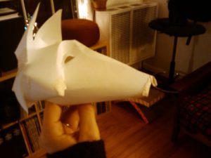 I feel better about this effort but am not totally sold on it. I feel better about this effort but am not totally sold on it.
The forehead doesn’t sweep up the way I would like it to, but I don’t have enough paper in the eye region to do that the way the pattern is currently cut. There’s a chance that I might have to do this one out of two pieces of paper. The advantage there would be that I could use two colors of veneer and get the red and white in the face without paint. |

I love the ears on the first model of Loki’s head. They remind me of horns from this angle. (Different mythology, but I think people will associate horns with trickery.) Most photos I’m finding of red foxes have a relatively short, narrow snout and a high forehead. I think the first model comes closer to that.
They make contact paper in wood grain patterns. It might be a bit tacky (in many ways) for what you want to do, but it’s pretty quiet when you flex it.
Thank you for the behind-the-scenes look at your work.
It’s the same set of ears on both figures.
What you said about asymmetry is interesting. I used to not care about symmetry so much. I thought it gives them more personality. However, I started to make them more and more symmetric because it started to annoy me that when I want the puppet to look dead on at the camera, I feel like one eye is focused, the other is not. Or when the face is straight, the two sides don’t look quite the same so it seems crooked to me, and no matter how I adjust it, it doesn’t look right. Maybe I am overreacting a little bit? Of course, there’s probably also some differences between camera and stage.
I also found the choice to leave out certain body parts interesting. I think often we can do without certain things if we can just make sure to encourage the audience to use their imagination.
It is different for stage and TV to a certain extent. For stage, you don’t need as crisp an eye focus as you do for TV. On the other hand, you can still have crisp eye focus and have asymmetry but, because TV tends to do more closeups I think the differences are more apparent than on stage.
We have a digital printing department at TC2 that can do one off pieces. I think the width limit is 54″ or something like that and I don’t know that there is a length limit. They charge by the area plus a setup which is of course much less if you have the finished file and they don’t have to do any design work. Let me know if you want me to check it out further.
That is a very interesting idea… Let me think about it and email you. Or we could talk about it when I’m home next week.