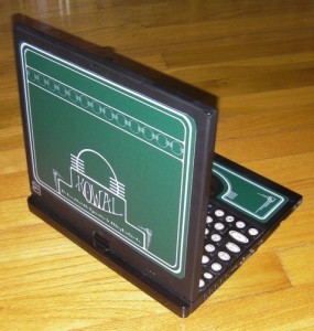
 Several years ago, I turned my computer into the Kowal Portable Typewriter and Adding Machine, basing the design on some of the typewriters my husband and I collect. When I had to replace that, I was sad and planned on modding my new computer. I got as far as making the stickers and then we moved.
Over a year later… May I present the Kowal Portable Typewriter and Adding Machine No. 2. The Deco model.
For the most part, I did this one the same way as the original one, but with some important changes that made the whole process go much, much faster. The first version took a couple of weeks to mod. This one took a couple of hours.
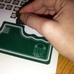 I laid out the stickers for the keyboard and the green “enamel” on a single sheet. Using a razor blade, I removed the “enamel” portion.(This time I ordered the stickers from sticviews). Edited to add: Less than 24 hours later, I’m having trouble with the “enamel” peeling up in one spot where my hands rest on it. I laid out the stickers for the keyboard and the green “enamel” on a single sheet. Using a razor blade, I removed the “enamel” portion.(This time I ordered the stickers from sticviews). Edited to add: Less than 24 hours later, I’m having trouble with the “enamel” peeling up in one spot where my hands rest on it. |
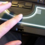 After placing the sticker to make sure I had it in the right spot, I smoothed it into place. These stickers are lighter-weight than the ones I used on the Kowal Portable No. 1 so the indentation shows where the machine’s original logo was. On the one hand, it is easier to get this sticker to follow the curves of the machine, on the other, it shows every bump. At some point I may peel the sticker up and fill that spot in. After placing the sticker to make sure I had it in the right spot, I smoothed it into place. These stickers are lighter-weight than the ones I used on the Kowal Portable No. 1 so the indentation shows where the machine’s original logo was. On the one hand, it is easier to get this sticker to follow the curves of the machine, on the other, it shows every bump. At some point I may peel the sticker up and fill that spot in. |
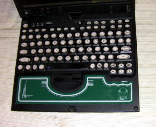
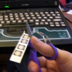 This model also went faster for two reasons. First, the keys were already black so I didn’t have to paint them. I also I handled the keys differently. Since the stickers are so much thinner, the edge isn’t apparent to the touch. I cut the stickers out around the edge of the key and let the black of the original keys act as the background. This model also went faster for two reasons. First, the keys were already black so I didn’t have to paint them. I also I handled the keys differently. Since the stickers are so much thinner, the edge isn’t apparent to the touch. I cut the stickers out around the edge of the key and let the black of the original keys act as the background. |
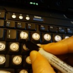 In one or two cases, I had to darken the decals on the original keys, but for the most part, they were hidden under the round typewriter stickers. In one or two cases, I had to darken the decals on the original keys, but for the most part, they were hidden under the round typewriter stickers. |
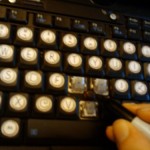 I also popped the keys off so I could darkened the trackpoint since I found the red jarring. I just stained it with a sharpie and expect I’ll have to refresh it at some point.As a side note, even though I clean the keyboard pretty regularly, the amount of cat fur under there was truly disgusting. I also popped the keys off so I could darkened the trackpoint since I found the red jarring. I just stained it with a sharpie and expect I’ll have to refresh it at some point.As a side note, even though I clean the keyboard pretty regularly, the amount of cat fur under there was truly disgusting. |
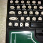 I used the same typewriter key image for this keyboard as I did for the Kowal Portable No. 1, but switched fonts to P22’s Art Deco Chic. I like the look of it on the large keys, but the small type is hard to read on some of the function keys.For the moment, I’m leaving the space bar black although I may put an ebony-finished wood veneer on it later, just because I liked the tactile sensation on the Kowal Portable No. 1. I used the same typewriter key image for this keyboard as I did for the Kowal Portable No. 1, but switched fonts to P22’s Art Deco Chic. I like the look of it on the large keys, but the small type is hard to read on some of the function keys.For the moment, I’m leaving the space bar black although I may put an ebony-finished wood veneer on it later, just because I liked the tactile sensation on the Kowal Portable No. 1. |
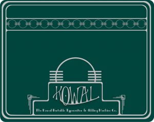
I stuck with the original logo from the Victorian era machine but updated the rest of the look to the 1920s. Here’s the original No. 1 enamel work and the No. 2 update. 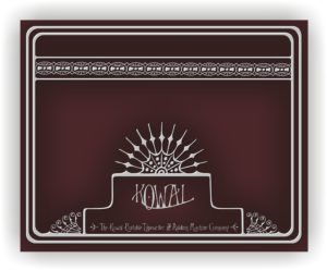
And here is the finished keyboard.
It’s funny how much happier I am to have a Kowal Portable again. Aside from getting the cat hair out in that one spot, nothing mechanical has changed but sitting down to write is already a more pleasant experience.
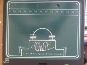 Edited to add: I was really not happy with the stickers that I used. A year later, this is what it looked like.
The resolution was poor, it scuffed easily and actually tore. I also had trouble with things pealing up.

Very pretty!
“As a side note, even though I clean the keyboard pretty regularly, the amount of cat fur under there was truly disgusting”
I so very much hear ya….
Beautiful!
And let me say it looks even better in person. 🙂
That is gorgeous! I have some serious laptop envy going and am already plotting how to do mine.
Wow! Very cool.
How crafty! It looks gorgeous. It makes me want to mod my own devices.
Classy!
Have you seen these USB typewriters/keyboards? I don’t know if you’ll think they’re neat or abominations. http://www.etsy.com/shop/usbtypewriter
Okay. If you go to Dragon*Con next year, and I go as well, let’s hook it up. You said awhile back that if I funded the stickers and came to see you, you’d make me a Portable Typewriter. This only solidifies my desiiiiiiire for one.
Fantabulous, dahling. Once again.
I _knew_ I had seen your computer somewhere before, when you showed it at 4th Street, but told myself that the one I was thinking of was purple. And here it is. It was you. I admired and envied you that first one so, so much! Just so you know. If I had just continued reading your blog then… well, silly me, missing out!
Ha! That’s very funny. You probably saw the original, which got more screen time than the new one has. I’m actually about to redo this one.