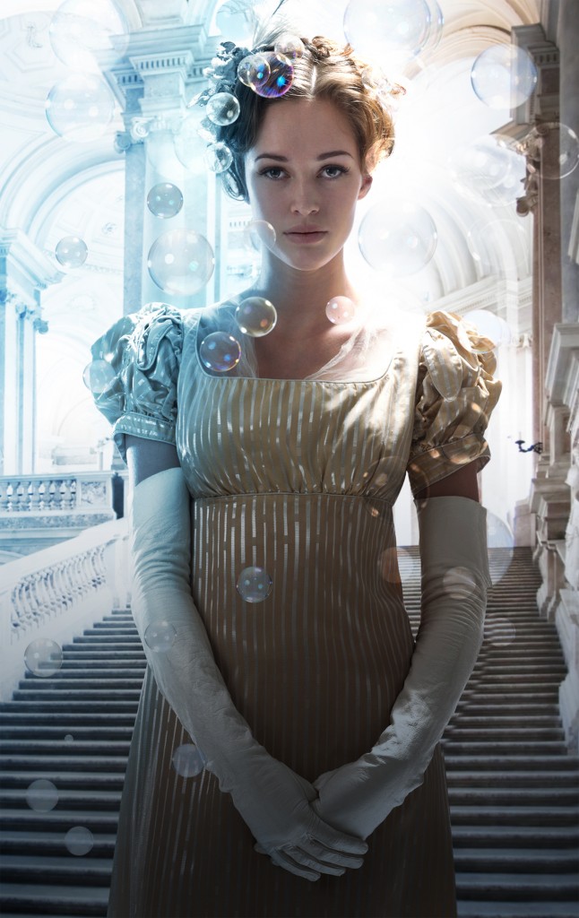
Would you like to see something cool? We’ve got the cover art for Glamour in Glass. It is really early to have this, but since Tor has given the okay, and it is gorgeous, I’ve get to show it to you.
You’ll notice that we’re moving to a photograph rather than historic art. The idea is that this will help catch a wider audience, which I think is likely. In fact, Tor had looked at doing that for the paperback of Shades of Milk and Honey but finding a photo that fit the tone and period was hard.
So for Glamour in Glass, they brought in Larry Rostant, who specializes in photos of historic periods. He created this specifically for my book and I’m delighted by the little details in it. I do recognize the fact that I’m geeking out over her kid gloves, of the correct length, is a sign of spending too much time in the Regency. But still! And that delicate fichu peeking out at the bodice’s neckline. So, lovely.
It will be exciting to see what happens when the designer gets involved and adds the type. I can’t wait. I so love books and the people who make them.
Meanwhile, I will tell you that on June 7th, when the paperback of Shades of Milk and Honey comes out, it will contain Chapter One of Glamour in Glass.


Oh this is just lovely!
I’m very excited by it.
Oh, this is AWESOME! I can’t wait to see what they do with the type, etc. Thank you for sharing!
I am certain that it will be lovely, because Irene Gallo, the art director at Tor, is very, very good and smart.
Looks great, Mary. I had several people stop me and ask “What book is that?” when I was reading Shades. As far the type goes, I’m hoping for GLAMOUR in GLASS where the “in” is in the script for “of” and “and” on the first cover.
(As I know nothing about this: are those eyebrows, lashes, and hair properly “period”? 🙂
Technically, no. The hair is pretty close. You see center parts more often, but side parts existed. As for the makeup? Ladies of the period weren’t having their photos taken so such details could be enhanced by the painter. They’d sometimes blacken their lashes with a burnt pin, so the mascara doesn’t bother me in the slightest.
Cool Cover. It’s not necessarily my cup of tea but it does look very sharp and professional.
Gorgeous!!!!!
Wow, that is…breathtakingly GORGEOUS. I think they’re right about a larger audience. Wow. One thing I’m really missing because of the digital age is no more gorgeous works of art on my covers. :/ Once I get a place of my own I’m tempted to start buying real books again just to have gorgeous art to goggle. Wow. That’s so exciting how cool this turned out! 😀
Gorgeous. Go ahead, geek out.
Very nice!
i agree with some that the typography is going to be a very critical element on this cover
That’s an amazing photo. Way to go Tor, and way to go you!
I can guarantee that this cover would get me to pick up Glamour In Glass and read the back cover. It has already been enough to have me putting you on my list of authors to read. I would not have picked up Shades Of Milk And Honey just because the cover does not appeal to me, but now I will. I hope you get a poster of this artwork, it is spectacular.
We’ll see you in Oregon,
Laurel and daughters
This is awesome!
And I really need to get to the first one before the second one comes out…
Lovely!
I love this Mary! It is absolutely beautiful!
Quite lovely
It has just the right touch of whimsy and period. The color and light are great! I’ll be buying this as soon as it’s hits the shelf!
Stunning, Mary, absolutely stunning!
Awesome stuff! When will this be coming out in print?
I’ve been told February, 2012, but that’s subject to change. I can tell you that it’s been turned in.