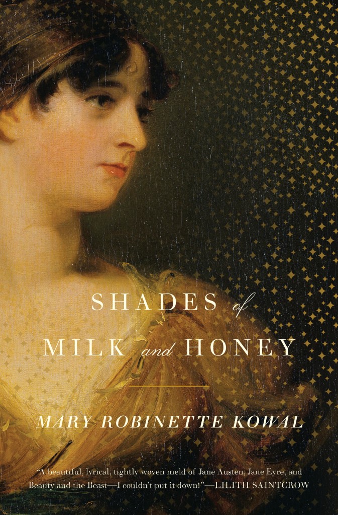
Allow me to present the cover for my debut novel, Shades of Milk and Honey. This thing of beauty was designed by Terry Rohrbach at Base Art Co.
Book designers often go unrecognized, with attention focused on original art and yet they are the ones that control so much of the look and feel of the book. I think Mr. Rohrbach nailed the elevator pitch of the novel, which is “Jane Austen with magic,” and provided an arresting cover that will stand out in the fantasy section.
I can’t wait to have a copy in my hot little hands.


LOVE it. Congratulations!
It looks great! I made sure it they had it on order at my local B&N.
Thank you!
It’s a fabulous cover that is very specific to the book.
Yes. There is no doubt about the type of story inside this proving that sometimes you can judge a book by its cover.
Real cool-age! It’s a keeper.
Oh, wow! I will have to try to get you to sign my copy at WFC 😉
I don’t think this will be any sort of a problem. I look forward to seeing you!
Mary, I definitely like the cover. When did you say it was coming out?
Shaun
It comes out on August 3rd in hardcover and audio.
Very nice! The font choice is particularly appropriate; elegant, alternating the restraint of the block caps with the free flow of the script, and very distinctive.
Wait until you see the interior…
Oh wow, Mary, that’s lovely!
Congratulations and the very best of luck with it.
That’s wonderful, Mary!
I’d been imagining a dashing rogue of an officer on the cover, but this is quite superior. 🙂
It will match beautifully with my Austen and Heyer collections.